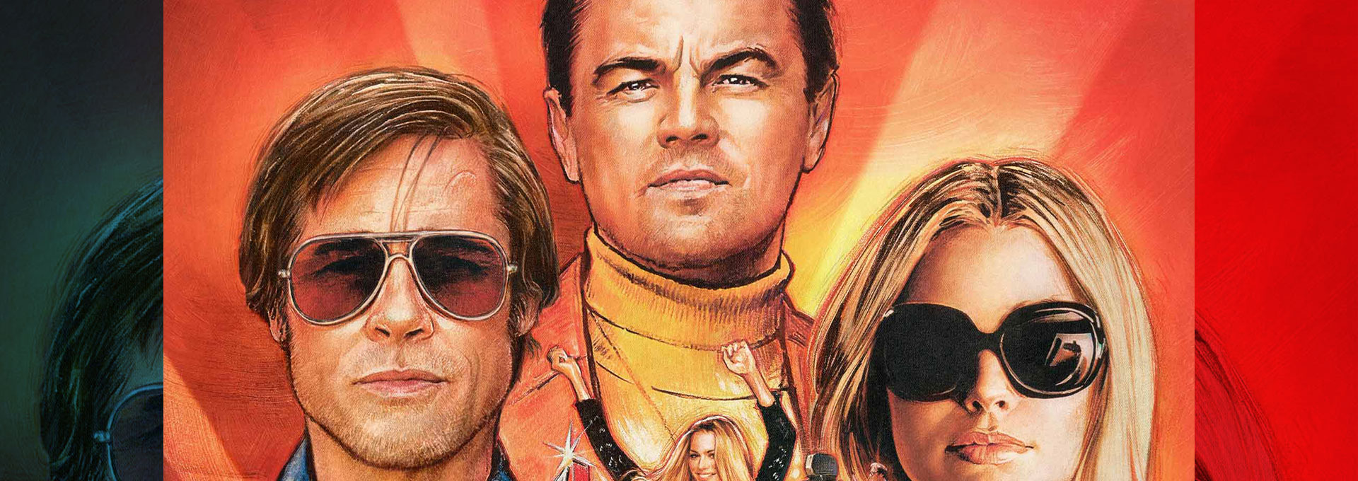
Some say the art of the illustrated movie poster is dead. They maintain that most major studios would rather have soulless floating heads jumbled together in a quick photoshop job than anything strikingly different. Others would say the illustrated movie poster is having a renaissance. With licensed screen-printed alternate posters from independent outfits like Mondo and Bottleneck Gallery, the art of the handmade movie poster has been flourishing outside of the Hollywood machine.
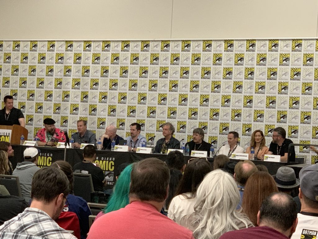
At San Diego Comic Con this year, ASIFA–Hollywood (International Animated Film Association) and an all-star panel of famed illustrators from the last 50 years of entertainment art came together to discuss their craft from the past, present, and future.
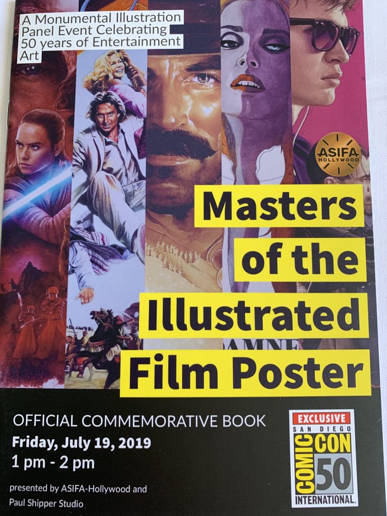
The panelists included Steve Chorney (Once Upon a Time in Hollywood, Who Framed Roger Rabbit?), Robert Rodriguez (The Jewel of the Nile, City Slickers 2), James Goodridge (Deadpool), Matthew Joseph Peak (Nightmare on Elm Street films), William Stout (Life of Brian), Paul Shipper (Avengers: Infinity War, Star Wars: The Last Jedi), Akiko Stehrenberger (The One I Love, Kiss of the Damned), Rory Kurtz (Baby Driver; I, Tonya), and Jason Edmiston (Evil Dead 2, Texas Chainsaw Massacre).
The panel began with the moderator, Stephen Kramer Glickman, asking the group what the art of illustrated movie poster means to them. Steve Chorney broke the ice with a simple answer: “We get paid to do it.” Chorney always wanted to be an artist, and once he had a job in the animation industry, he saw a poster John Alvin did for Blazing Saddles. “That made me think I should be doing this, and I moved in that direction,” he said.
Artist James Goodridge recounted how as a child he would remember images that stuck with him over the years, like seeing Alice Cooper’s Greatest Hits album cover in a store. Years later he saw a poster for the first Star Wars movie that stood out to him. At the time he didn’t know both pieces of art were done by world famous artist Drew Struzan. When he looks back, he can see little points in his life that were pulling him in a certain direction. “This means something. This pulls at my heart,” he told the crowd.
No matter what got them into the industry, all the artists agreed that what they do is important to keep the art form alive. Some, like Akiko Stehrenberger, spoke of seeing something new every time she looked at a classic illustrated movie poster, something you don’t often get with a photoshopped image. The idea inspired her to hide Easter eggs in her own work, or even references to plot points that fans wouldn’t notice or even understand until they saw the film themselves.
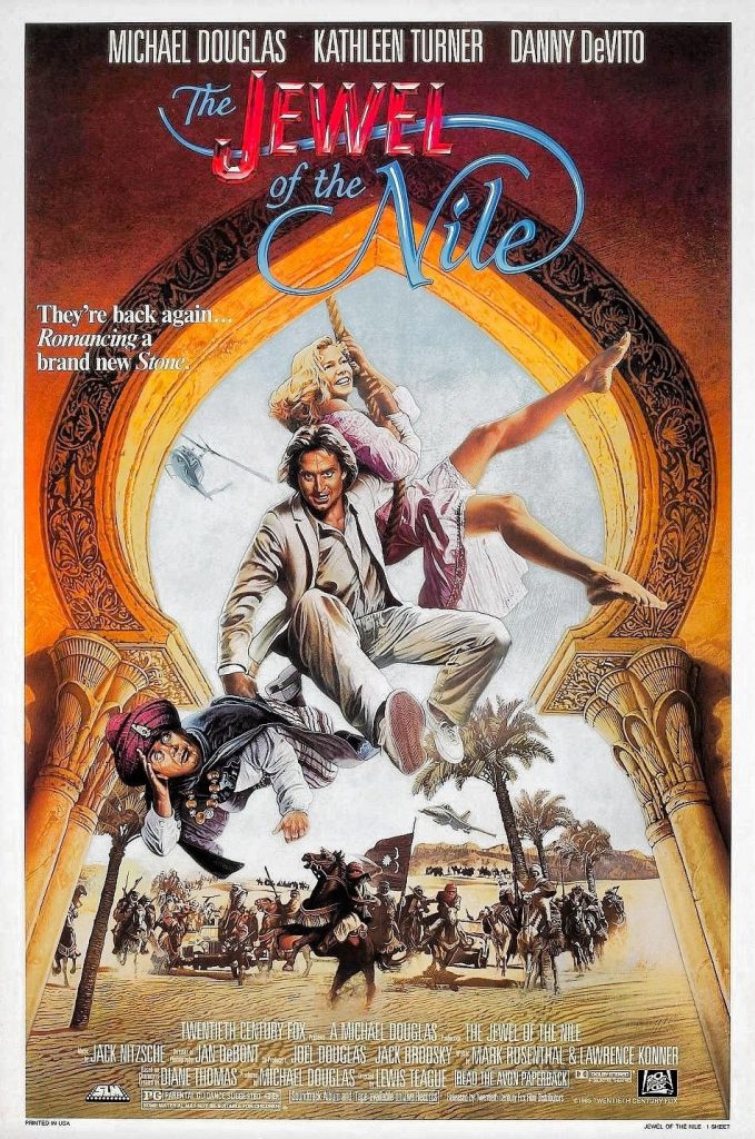
The group also commiserated about dealing with studio notes. Robert Rodriguez brought up an amusing anecdote regarding last minute changes. While working on a poster for Jewel of the Nile he was asked to make significant alterations to the size of the character’s heads in the piece. He complained to the art director, who told him, “Every time they want to make a change, you smile and say, ‘Of course we can do that, no problem, that’s just another $500 or $1000 dollars.’ In the end the $10,000 job ended up being $39,000. It was good advice.”
Before the panel wrapped, each artist discussed where their ideas came from. Both Akiko Stehrenberger and Rory Kurtz said that they liked to watch the films they were working on for inspiration. Sometimes a single powerful frame or image would jump out and inspire the poster. Stephen Kramer Glickman concurred and pointed out that sometimes, if done well, a movie’s poster is the one thing people will remember about a movie—sometimes, even more so than the film itself.


